
12 Common UX/UI Web Design Mistakes and How to Fix them

Nowadays everything is about the experience. When a user reaches your website, they have expectations and desires that you should be ready to fulfil. They have a mental model of how a website should look and act and how information should be displayed.
The user experience influences how users perceive and react to your business. The navigation, features and elements of your pages can strongly influence your conversion rates and that is the reason why you should give it the attention it deserves.
Today we’ll present you 12 common mistakes in user experience and how you can overcome them to create a better UX/UI experience on your website and e-commerce.
Mistake 1 – Slow loading time
We live in a fast-paced world. This means that our brains are being used more and more every day to access and retain information faster than ever before. Unfortunately, our patience is at an all-time low. After all, who has 5 seconds to waste waiting for a website to load its content?!
Studies have shown that as loading times increase on a website, user satisfaction decreases since it leads to frustration and a decrease in trust.
According to Google’s Core Web Vitals, websites should load in less than 3 seconds on desktop and ideally within 1-2 seconds on mobile. To increase that, you should look at a few factors such as:
- server response
- image optimisation
- JavaScript execution
- Third-party scripts.
We recommend that you continuously monitor load times across different devices and network conditions, so you can keep the user experience a top priority.
You can always check your loading time using free tools such as Page Speed
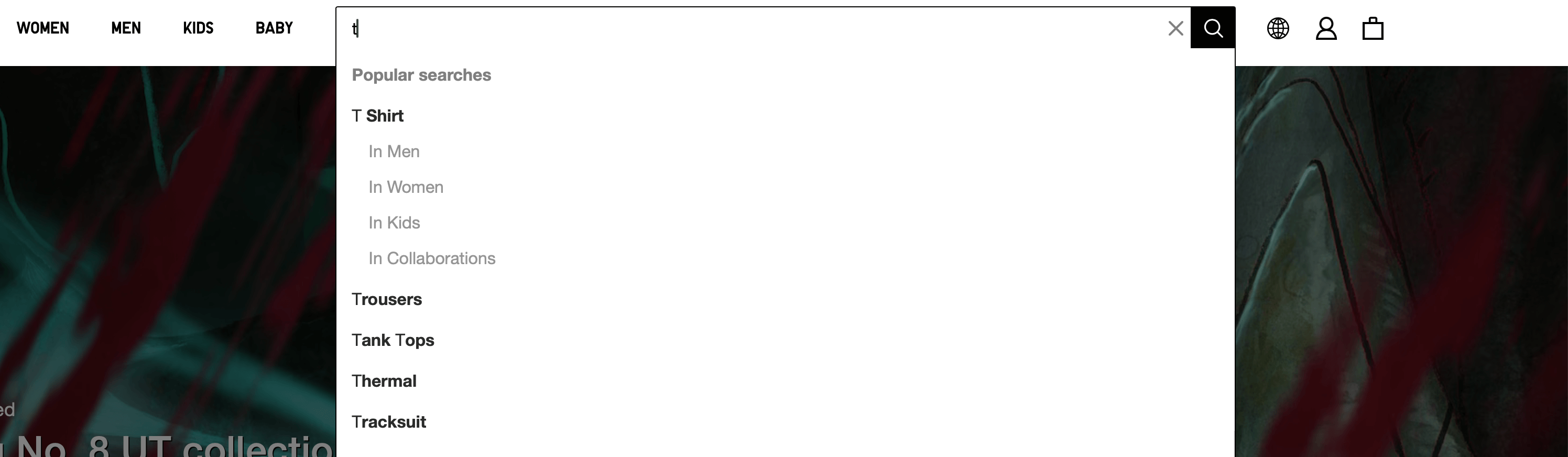
Mistake 2 – Complex website navigation
Users have a mental model of website experiences. That means that user navigation should be an intuitive action when they land on your website. Pay attention to your menus and CTAs – are they leading people to the correct page/action? Are the labels clear and logical? If not, you are probably committing this mistake.
When you miss the user’s expectation of something that should be intuitive, you must educate your user on how to navigate your website. And unfortunately, that takes time – and remember mistake number one? – users are becoming less patient, so everything should be as intuitive as possible to keep them engaged on your website.

A solution is to look at the market – how do other websites label their categories? How are your users used to finding information as they go through the customer journey? Create a strategy for your website that follows the industry conventions, so you can keep your users engaged for longer on your website.
Mistake 3 – Poor readability and typography
Readability and legibility can be essential to provide a successful user experience on a website. According to Harvard University, some people may have difficulty tracking along a line of text if its line height is too wide or too narrow and some people need to enlarge text to read it and will not be able to access content set in a text size that is small or doesn’t scale correctly.
To provide a good experience for your users you need to be careful with the text disposal and pay attention to details such as font choices, text alignment, text sizes, colour, contrast of the text with the webpage, visual and semantic space and case types.
All of this can determine if it will be easily scannable, easily accessible for people with disabilities and will engage your user with the content you would like to share.
The Readable website is a great tool for checking texts, files, websites and emails readability.
Mistake 4 – Cluttered Layouts
We all know the phrase “less is more” right? And that applies to User Experience too. If you overload your webpage with too much content and too many elements, it can be a bad experience for your users.

Interfaces should not contain information that is irrelevant or rarely needed. Every extra unit of information in an interface competes with the relevant units of information and diminishes their relative visibility. Take some time to review the essential elements, and the visual hierarchy and embrace white spaces to improve your users’ attention to your website content.
It’s important to keep your business strategy aligned with the User Interface to lead the user through the expected action on the website. So, always keep that in mind when you are creating a page on your website. Ensure that the visual elements of the interface support the user’s primary goals.
Mistake 5 – Not prioritising the mobile experience
According to the International Telecommunication Union (ITU), there were more than 8.58 billion mobile subscriptions in use worldwide in 2022, compared to a global population of 7.95 billion halfway through the year. That means that we have more mobile phones in the world than people. So, keep in mind that your user will probably reach your website through the mobile experience.
A common mistake when designing a website is prioritising the desktop experience rather than the mobile one, and when that happens, the mobile experience becomes responsive, which can result in a bad experience if you are not paying the necessary attention to the page breakpoints and elements disposition.
Looking at your website with a mobile-first mentality can help you avoid committing this mistake. Design for small screen sizes first and then expand to larger device sizes as this will probably be the first contact your users have with your brand, so it’s important to keep their first impression good, right?
By avoiding these mistakes, you will be creating a good and consistent user experience for your website. That way, you can keep people more engaged with your content and offers and lead them to your website’s main goal.
Mistake 6 – Complicated navigation and categories
When it comes to shopping, it’s well known that users will spend time browsing multiple sites before buying a product. With that said, users should not have to wonder whether different words, situations, or actions mean the same thing. It’s extremely important that your website follows platform and industry conventions, so it can become easily recognisable and intuitive when it comes to navigation.

Mistake 7 – Hidden or inadequate search functionality
Although some users come to a website knowing what they want to purchase, in most cases, users will spend some time doing research about similar products and comparing prices before completing an order. This is why your search functionality must be their best friend.
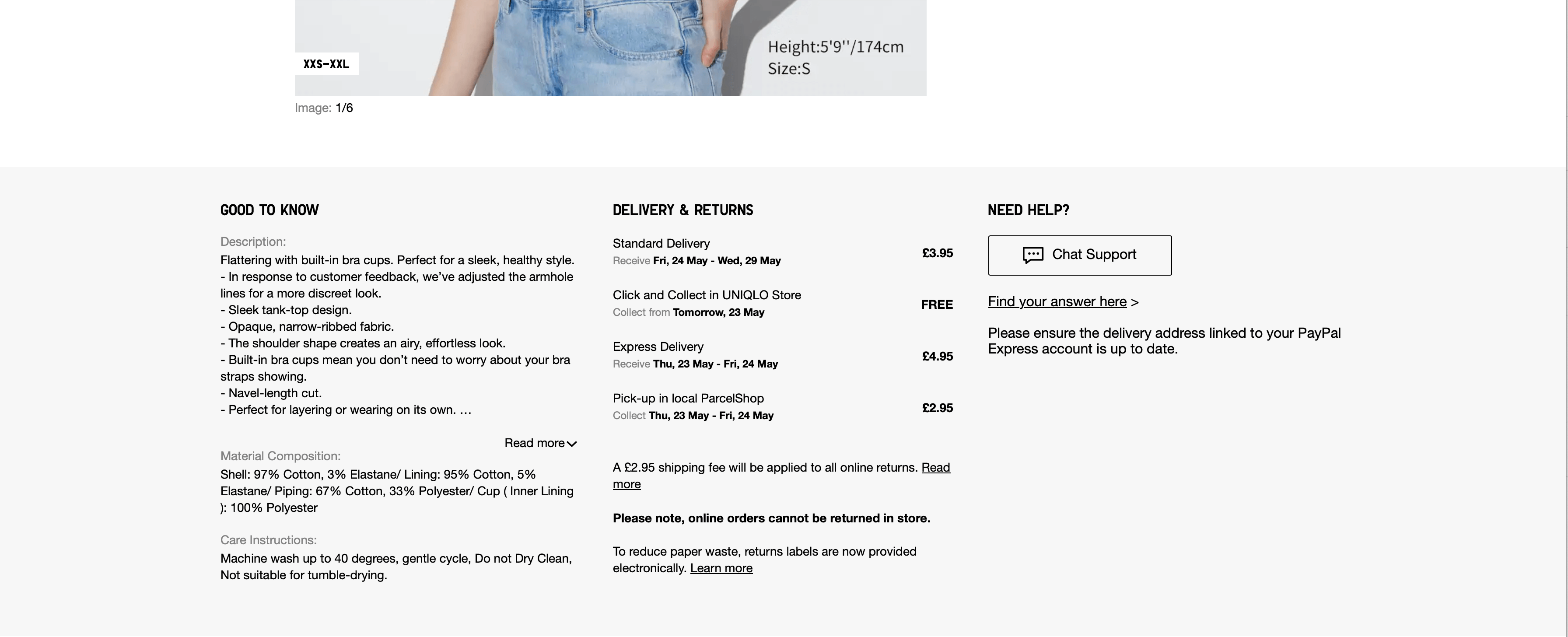
Mistake 8 – Lack of product descriptions
When you walk into a store and see a product, usually you’ll have a seller to assist you and convince you that the product is exactly what you are looking for.
Now, imagine, when a buyer comes to your website, how can you provide the same experience?
The product description is essential to providing everything your buyers need to know about the product. It is the place where you can persuade them effectively, showcase technical details and provide answers to possible questions. A product description can turn a visitor into a buyer, so use it well.
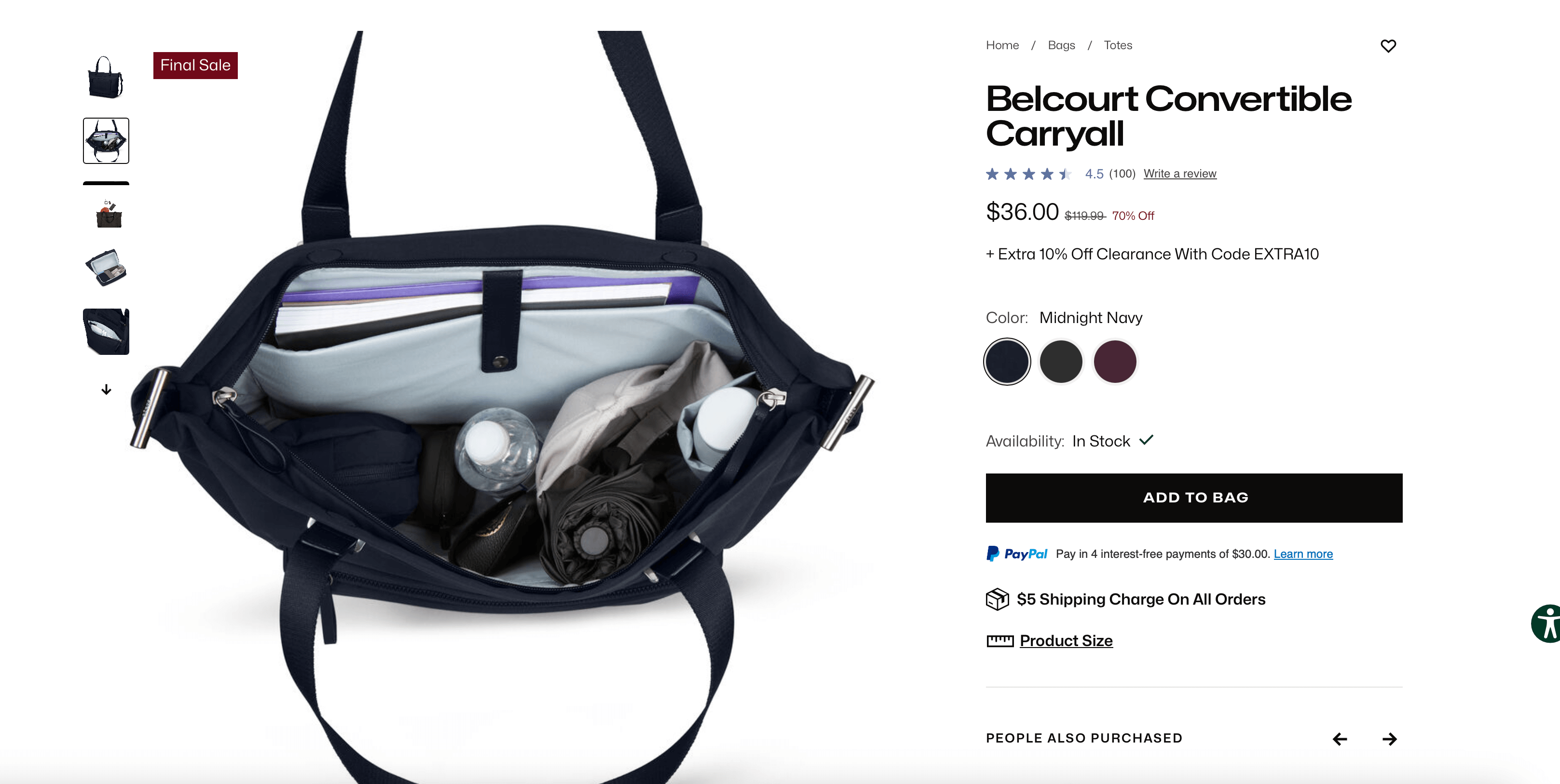
Mistake 9 – Low-quality product images
The brain is built to process visuals, processing visual information up to 60,000 times faster than text. This means your e-commerce images are the first impression users have of the product, so they can play a vital role in the decision-making process.
When displaying images on your website, think about every detail your user would like to know about the product you are selling. Make the images big enough and detailed enough, keep some cohesive and consistent background colours to provide a smooth experience, and always ensure you provide a good zoom-in/out feature for each picture.
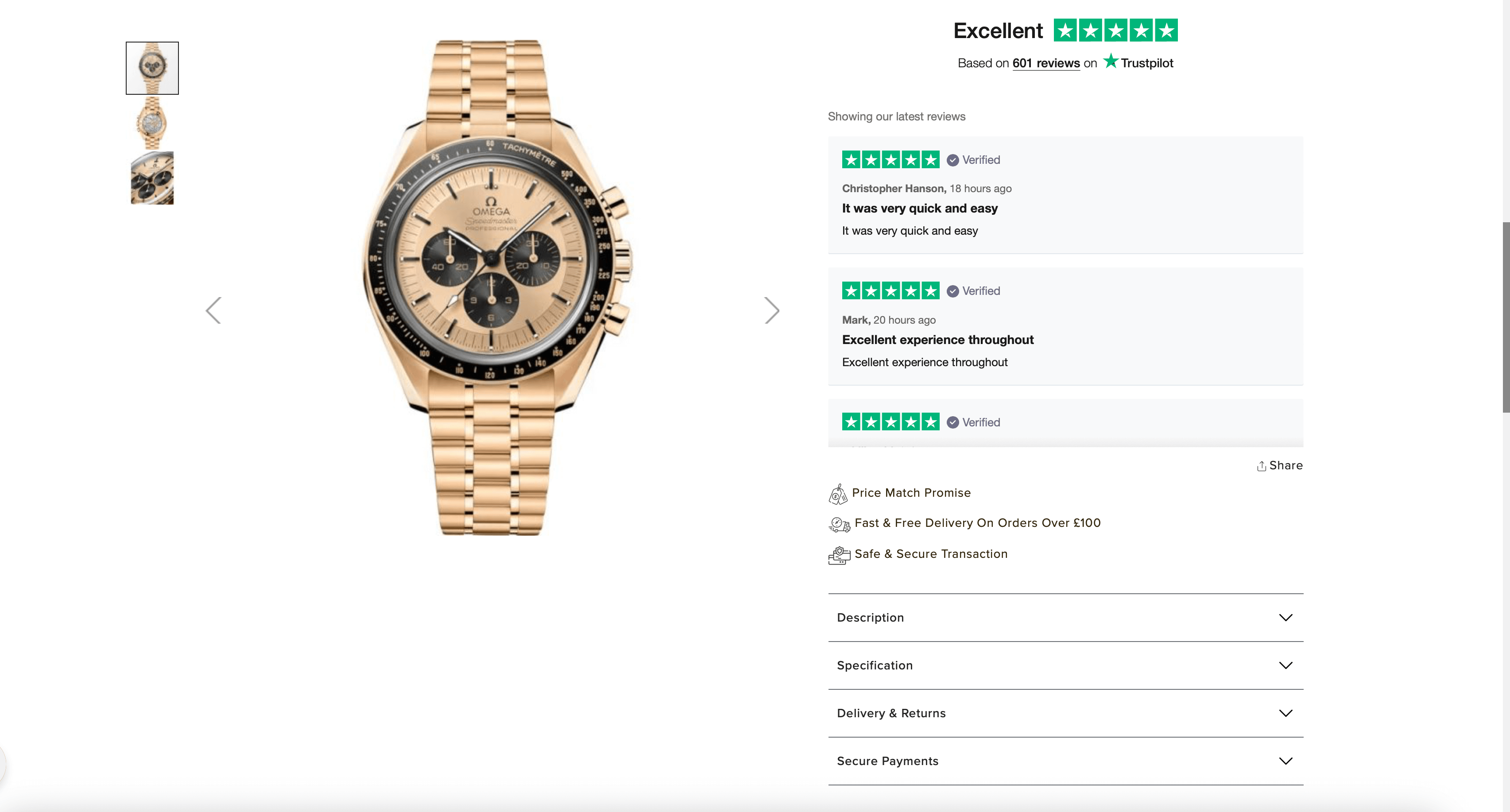
Mistake 10 – Lack of trust signals
Your e-commerce store needs to build trust with your customers, and the best way to do this it is by displaying security and trust badges, customer reviews and testimonials, clear payment methods and even social media pictures.
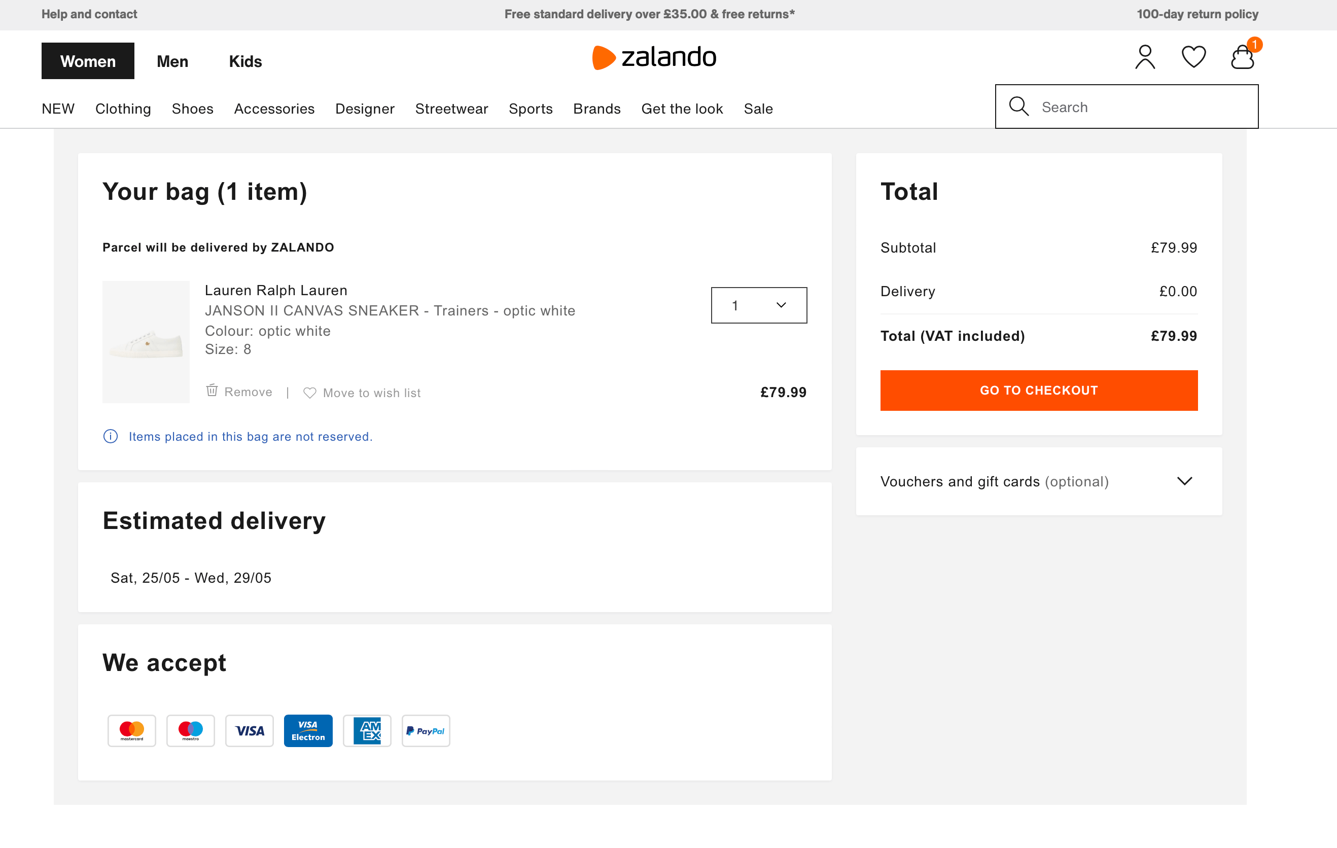
Mistake 11 – Ineffective cart management
This mistake is one of the most critical, but still happens far too often. Your cart needs to be easily manageable; the user needs to be able to remove items or change quantities intuitively and easily. Many shoppers will make the final purchase decision on the cart page.
Research made by Norman Nielsen’s group has shown that shoppers use the cart as a holding area, to collect the items they’re considering before making the final decision and proceeding to checkout.
The ideal cart provides product details, links to the product pages, lets users easily remove or change the quantity of products and provides essential information about shipping and taxes.
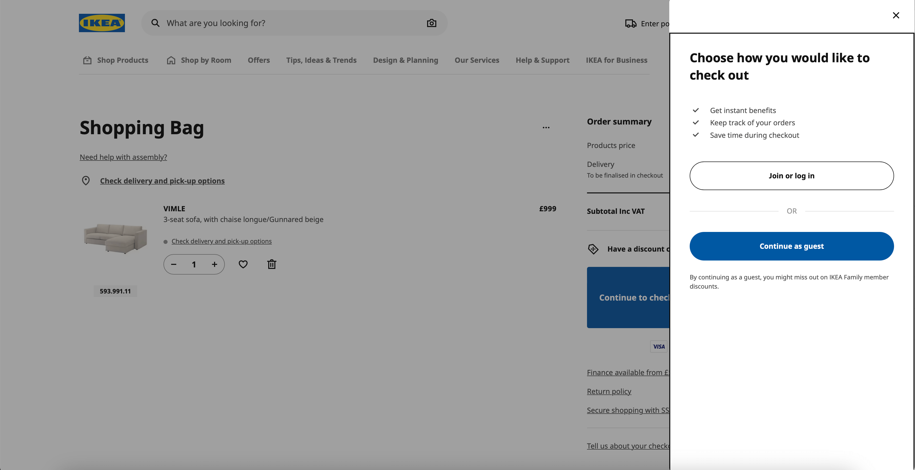
Mistake 12 – Complex checkout process
The checkout is the last step the user will reach before buying a product. It is usually where some clients can abandon the process, so we must keep it simple and fast to decrease the chances of abandonment.
Give your user the possibility of guest checkout, fast payment checkout and implement a streamlined flow with progress indicators. Usually, we like to recommend a one-page checkout, but if that’s not possible for your business, you should keep the steps simple and clear for customers.
By avoiding these mistakes, you will create a good and consistent user experience for your business, and they will be more likely to return and become consistent buyers. Here at Autify we can provide you with the necessary help to improve your website or e-commerce by reviewing your user journey, marketing and design strategies, and creating new flows and features for your website according to the market necessities. Don’t hesitate to contact us if you need our help!